Interactive infographic reveals outcomes of non-touch therapies
December 2, 2016
by John Weeks, Publisher/Editor of The Integrator Blog News and Reports
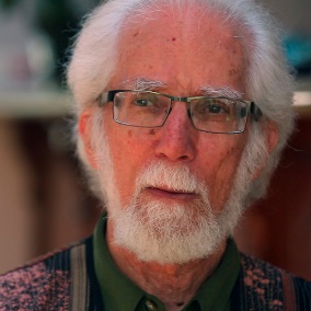
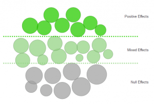 On November 5, 2016, the aptly-acronymed Consciousness in Healing Initiative (CHI) convened. Multiple luminaries in biofield science, pioneering figures including Larry Dossey, Deepak Chopra, Mimi Guarneri, and Beverly Rubik, each took a turn on stage. But, to this observer, a real hit of the jam-packed, one-day conference was, in fact, an interactive infographic that showed the fascinating results of non-touch therapies. The infographic was the brainchild of Shamini Jain, PhD, below right, CHI’s executive director and an assistant adjunct professor at the University of California at San Diego. The graphic itself includes a link to the study it is based on for a handy reference. The graphic was based on a 2014 systematic review, “Nontouch Biofield Therapy: A Systematic Review of Human Randomized Controlled Trials Reporting Use of Only Nonphysical Contact Treatment.” It was led by Richard Hammerschlag, PhD, below left, co-leader of CHI and a scholar at the Institute for Integrative Health from 2006-2013.
  As the title of the article states, none of the 28 trials involved any physical contact. The modalities were external qigong, Healing Touch, Johrei, Reiki, and Therapeutic Touch. Yet, as displayed in the graphic, of the 28 trials, 8 showed positive effects and 12 showed researchers mixed effects. In 20 of the 28 trials, there appeared to be some reaction through the biofield co-habited by the practitioner and subject. Jain, formerly a senior scientist with the Samueli Institute, wanted to make these outcomes, and any questions raised by them, accessible for clinicians, other scientists, and the public. The result was collaboration between Jain, Hammerschlag, and medical device entrepreneur Lauren Evanow. The group developed the infographic linked here. The size of each circle represents the quality of the study. Of the 28, 18 were determined to be of medium to high quality. So, while a quick glance reveals that the vast majority of the studies found at least some effect, one also quickly sees that many of those deemed to be of the highest quality found null effect.
  What if these are broken down by the type of therapy; or by the sex or age of the subjects; or by the duration treatment time; or outcomes based on whether the study had a “sham” comparison group , which 21 of the trials did? In each case, a single mouse click provides a visual answer. Comment: I find something warming in this level of transparency, particularly from these scientists, whose curiosity takes them into Wild West frontiers of science where more conventional colleagues would often rather gun them down rather than look at data. This presentation makes it harder to look away. Credit Jain, Hammerschlag and Evanow for putting on display the “null effects” of the highest quality studies. More importantly, credit them for allowing us to be children and to play with the data. Who would have guessed, for instance, that the only two with all male subjects would each show positive effects, while those with only women would spread only into “mixed effects” and “null effects” columns. It’s fun to play with, while reflecting on the apparent phenomenon of the biofield. Where does one of us end, and another begin? Take a quick look!













SHARE